Body, Structure and Content: How do they work?
One of the biggest strengths of the editor is that it provides creative professionals with tremendous design flexibility.
This is achieved by separating the concepts of Body (settings that apply to the entire document), Structures (rows of content which can be added, removed, copied, & moved) and Content (individual content blocks: images, text, buttons, etc., which also can be added, removed, copied, and moved).
Body
These are the general settings and apply to your document as a whole.
They are inherited by Structure and Content blocks. For example, the font family set in the body settings is then used everywhere in your message, except where you use a custom setting.
This is very useful to build a coherent message very quickly.
 |
| Body Properties | Explanation |
 |
This will adjust the content area of the whole document. For sending emails it is recommended to have this set at 650px |
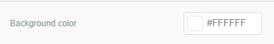 |
This applies the selected colour as a background for the full width of the document |
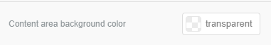 |
This applies the selected colour as a background to the content area in the whole document and will be the width as set in the Content area width slider |
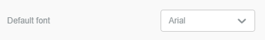 |
This will apply a default font for all Text content used in the document (it can then be individually changed in the content setting) |
 |
This will apply the chosen colour to any link that is used in the document |
Structure
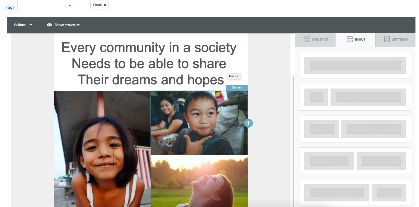
Here you can find different types of rows to insert into the document.
Rows are structural units that define the horizontal components of the document by using columns. You can use from one to four columns, with varying widths. A row can also be more than one content element in height.
Using more than one column allows you to put different content elements side by side.
You can add to your messages all the structural elements you need, regardless of the template you selected when you started.
When a row is selected you have the option to delete, copy or move this in the document. These options are shown by blue icons in the highlighted row.
 |
Every row has its own settings, which gives you the kind of flexibility that before was only achieved with hand-coded email.
| Row Properties | Explanation |
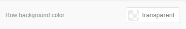 |
This applies the selected colour as a background for the full width of the current row, replacing any colour set as a background for the whole document |
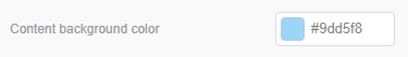 |
This applies the selected colour as a background to the content area in the current row |
  |
This setting allows you to turn off automatic stacking of content when being viewed on mobile, the row will keep the column format. The top row is not stacked on mobile but the second row is stacked. It is important to test your documents by viewing on mobile to ensure the format is enjoyable and easy to follow |
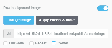 |
This allows you to set an image as the background for the current row. You can add an image from the File Manager or enter the URL for an externally hosted image. There are three alignment settings for this: Full width- This will place the image on the far left, using the entire width of the row instead of the content area. If combined with Repeat, the image will be repeated in a tile effect across the entire width of the document. Repeat- This will repeat the image in a tile format, vertically and horizontally. Centre- This will centre your image in the row behind your content |
| Column Properties | Explanation |
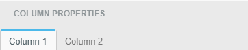 |
As well as being able to apply settings to the whole row, when multiple columns are used you can set each one with unique properties |
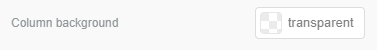 |
This applies the selected colour as a background to the chosen column, as selected in the tab above |
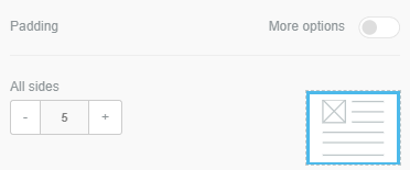 |
Padding can be set for all sides or individually by switching on the More options setting. Padding increases the blank space between your content area and column area |
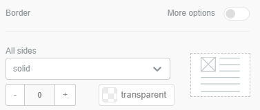 |
A border can be applied to all sides or you can apply individual settings to each side by switching on the More options setting. You can choose the border type; Solid, Dotted or Dashed, the border weight/ thickness and the Colour. Borders can be used to create a table look for a receipt document or as a vertical divider between two columns. |
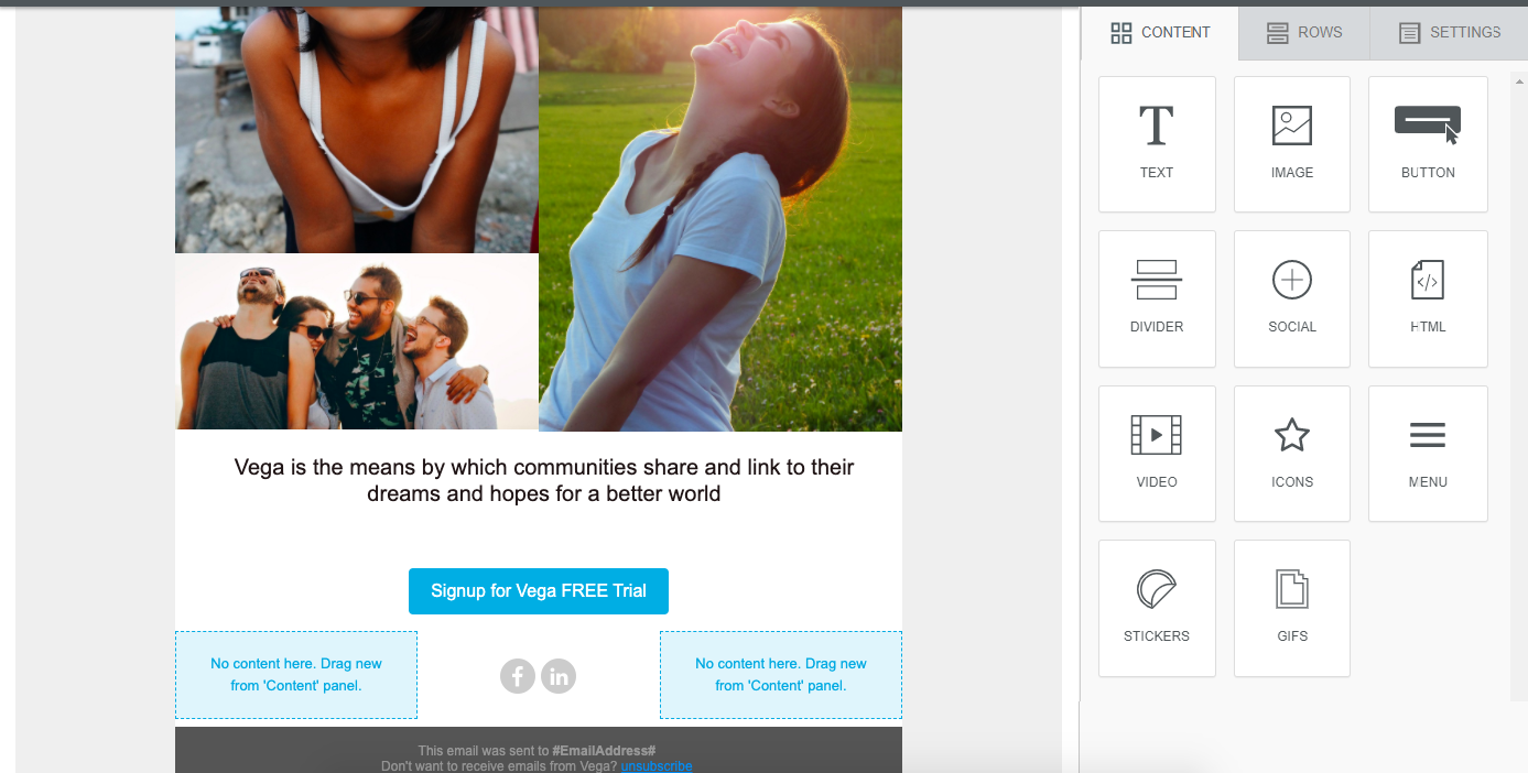
Content
This section includes a series of tiles that represent the different kinds of content you can use in your message. To use them, just drag one inside a column, it will auto-adjust to the column width.
When content is selected you have the option to delete, copy or move this in the document. These options are shown by blue icons in the highlighted content.
Every content block has it owns settings, such as granular control or padding. The right-side panel automatically switches to a property panel for the selected content element.
 |
Below is a summary of all available content, click the image and the link will take you to another article on their available settings.
| Content | Explanation | Content | Explanation | |
 |
Add Text, Links or Merge tags and apply formatting to these |  |
Adding a Youtube or Vimeo video link is a great way to interact with your contacts | |
 |
Select an image from your File Manager, upload from your computer or use a free stock photo. There are many exciting features and settings that can be applied to your images |  |
Add your own icons and apply a range of effects | |
 |
Add a button to link a file or use as a call to donate and link your Vega Donation Widget |  |
Build menu tabs so your contact can easily navigate to the correct link | |
 |
Add a divider line to make your document more enjoyable and easy to follow |  |
Adding a sticker from Giphy is a great way to add some animation and fun to your document | |
 |
Adding Social Links are a great way to connect in multiple ways with your contacts |  |
Adding a Gif with Giphy is another way to add animation and fun to your document |
|
 |
You are able to add HTML code directly to your document but please ensure an HTML expert writes this to ensure your document is rendered correctly |
|
There are different tags for sharing and following when using the social media component.
Sharing vs. following
We tried to better clarify the social share vs. social follow thing. As you know, you can add a social media icon to an email for two reasons:
- To ask people tofollowyou on that social network
- To ask readers tosharethe message using that social network
So... we now made it easier to identify what you are using your icons for. If you are adding a social sharing icon, the editor now adds a big "Share" tag to it.
For example, compare this Facebook "follow" icon...

... with this Facebook "share" icon:

Also, one clarification on social sharing. You can use it in two ways:
- You enter the URL to be shared, like in the example above.
- You enter a merge tag that will be replaced by whatever application will send the message... typically with the Web version of the email.
Since this second scenario is very popular, BEE adds a placeholder merge tag to the Urlinput field by default. The merge tag is called "ShareOn". Change it with whatever your merge tag your email service provider uses (or replace it programmatically yourself if you are embedding BEE into your application).

sourced BEE Editor
Comments
0 comments
Please sign in to leave a comment.